top of page


The Purpose.
Access Direct is a locksmith company that is unique for its industry. Through a color refresh, new graphics, a new website, typography, and branding I brought a fresh look to the company.

The goal for Access Direct is to give them a clean platform that stands out from its competitors. The focus is on the branding, and the UX/UI to improve the overall customer experience.

DESIGN.
The use of large bold typography gives a sense of strength and security. We wanted to include animation and other fun design elements that would often be overlooked in the locksmith industry.
Type.
Type Family - Avenir
5678
abcdefghijklmnopqrstuvwxyz
ABCDEFGHIJKLMNOPQRSTUVWXYZ
0123456789
!?@#$%^&*()_+/{}<>:;"',.~`|-\
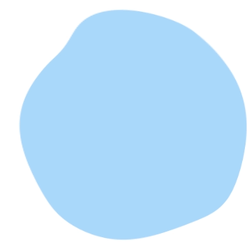
Color.
#a9d8fb
#4155d8
#16216a
Icon Set


bottom of page